Interaction Design Comparative Research
By Neha Deshmukh
EQUIP

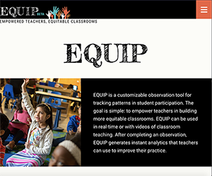
I tried using a web application called EQUIP, which is a observation tool made for tracking student participation in classes. The goal is to create more equitable classrooms for children to grow in. The home page interface is fairly simple. The page has a menu symbol at the top-right corner of the page with a bold color to make it stand out. The menu shows a drop-down with different navigation items. In case of forms, the main navigation menu has an option for signing up to the service and there are also buttons throughout the page for the user to be directed to a sign up form. Much of the content on the page has been cut down to show only important or attractive parts and a ‘read more’ button for the user to further learn about the organization. A lot of this content is also placed in bold-colored boxes or under big headings to show their importance. Other than the main navigation and the logo on the far left on the page, there is no specific navigation which leads the user to move through pages. The functionality of this website is well done since each element is doing what I would expect it to. The buttons have a hover element which enables users to realize that it is clickable. The menu icon used is a universal icon used in websites across the web as well as mobile applications. The website is well designed in terms of functionality and overall aesthetic. I would have liked it to have more information on the main page instead of having previews of information, especially since the website only has 3 pages to navigate to. At first site, this website made me realize that it was related to education and classrooms, with pictures of little kids as well as older college students on the page.
Project READY

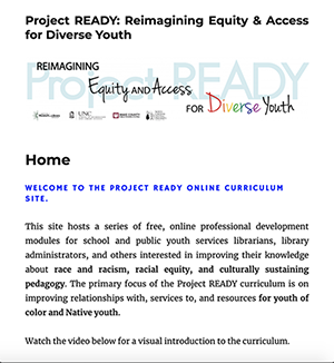
The second web application I tried was Project READY: Reimagining Equity and Access for Diverse Youth. This website has a series of free, online professional development modules for school and public youth services staff to help improve their knowledge about race, racism, racial equity, and culturally sustaining pedagogy. The website attempts to create awareness towards different cultures and diversity of color. The website is straightforward and plain with a simple scrolling page and a navigation panel at the end of the page. The color scheme is also plain white which is good in terms of visibility but lacks in aesthetic. The website has a lot of text which gets tiring to read if the user is only interested in a brief idea of the organization. The search bar is also at the end of the page which is a little inconvenient. There is a short form which asks for the user’s relation to education systems, with a submit button and hover element. I think the layout of the page could have been better and more convenient for the user. At the moment, the layout makes the user scroll all the way down to the end of the page to be able to navigate to another page, or even search through the website. With a reduction in text and slight addition of color, the website would be better aesthetically. The website made me feel like the topic was very serious and does not need to be sugar-coated to be made important, which gave the perfect vibe for a website which is meant for equity and diversity. The website does not have any images which makes it feel unnecessarily long and unattractive, but the header graphic has a good collection of words related to the topic of equity and diversity.